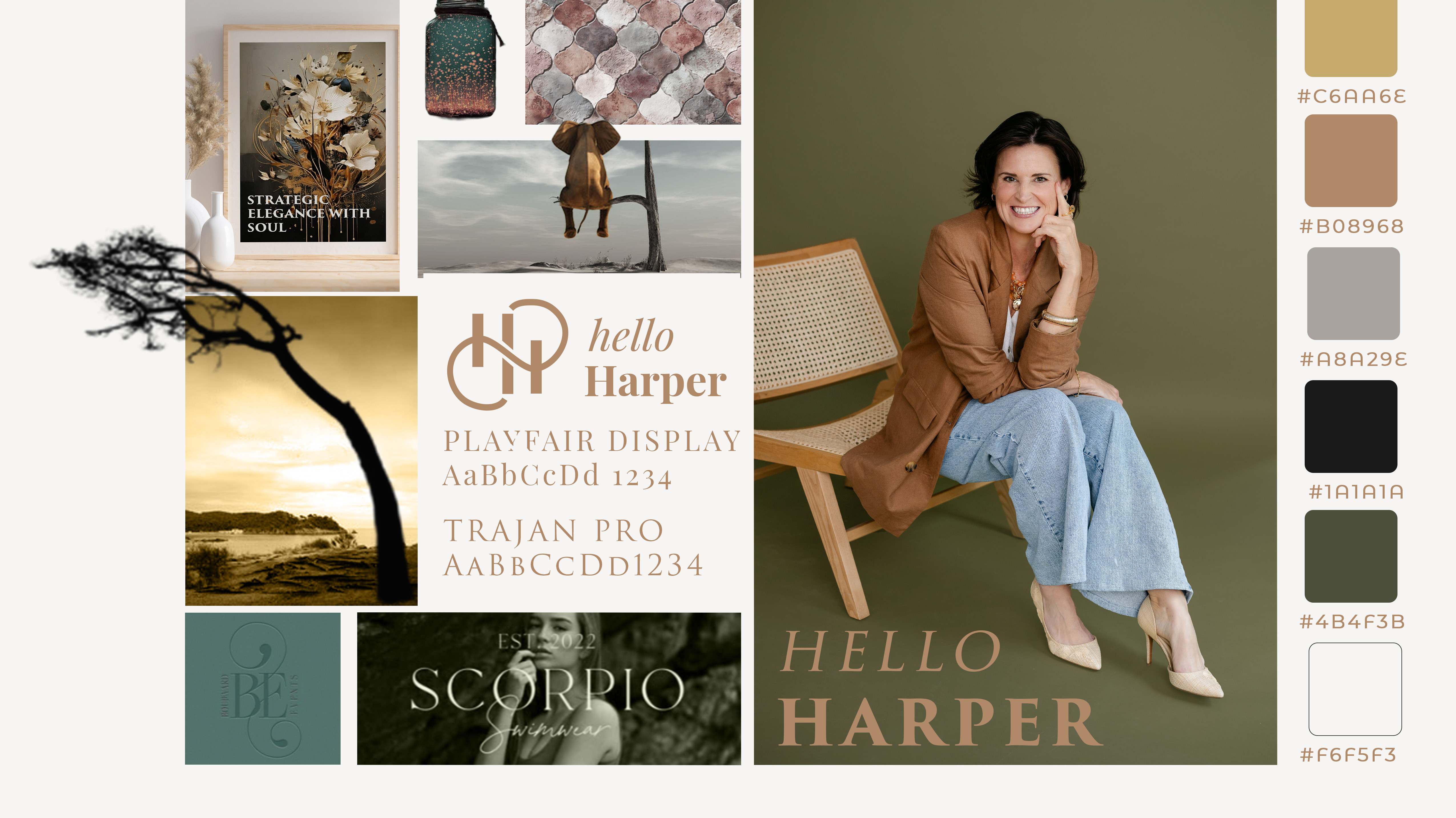
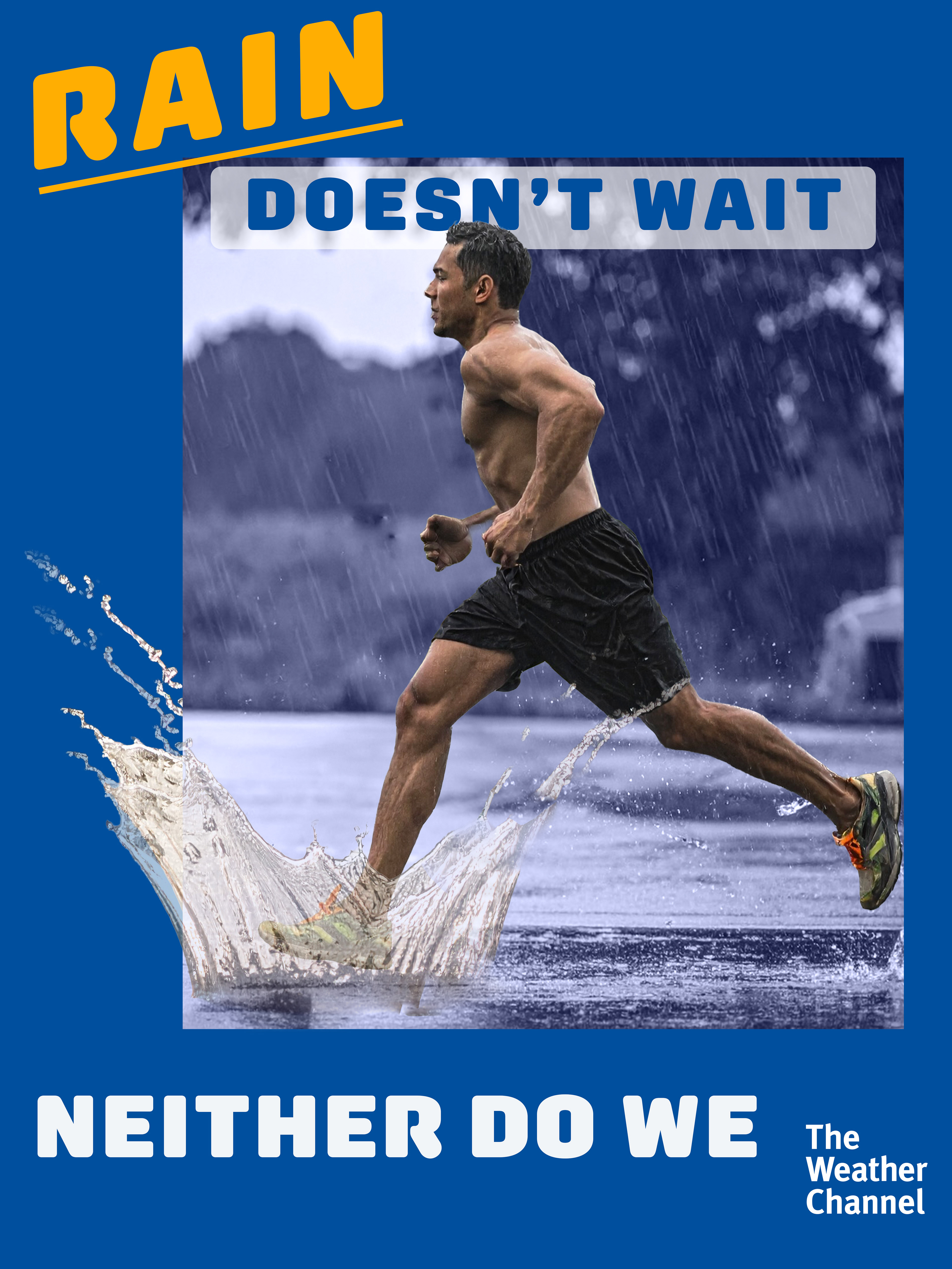
Weather is Personal
Advertising concept for The Weather Channel · ADBR 150
Summary
A campaign reframing weather data as deeply human. The goal: shift perception from information to emotion — showing how weather shapes memory, mood, and connection.
A campaign reframing weather data as deeply human. The goal: shift perception from information to emotion — showing how weather shapes memory, mood, and connection.
Challenge
The Weather Channel’s branding leaned factual. The task was to re-ignite audience empathy and position weather as a shared human experience.
The Weather Channel’s branding leaned factual. The task was to re-ignite audience empathy and position weather as a shared human experience.
Insight
People don’t remember the forecast; they remember the moment it mattered — the picnic before the storm, the walk under unexpected sun.
People don’t remember the forecast; they remember the moment it mattered — the picnic before the storm, the walk under unexpected sun.
Strategy
Humanize data by tying it to lived experience. Visuals and copy invite viewers to see themselves in every forecast.
Humanize data by tying it to lived experience. Visuals and copy invite viewers to see themselves in every forecast.
Execution
Three-part ad series using metaphor and personal tone
Soft natural palette and ambient typography
Digital mockups for mobile, print, and OOH placements
Tagline: Because every forecast has a story
Reflection
This project taught me that effective advertising balances clarity and emotion — data becomes compelling when it feels like a mirror.
This project taught me that effective advertising balances clarity and emotion — data becomes compelling when it feels like a mirror.
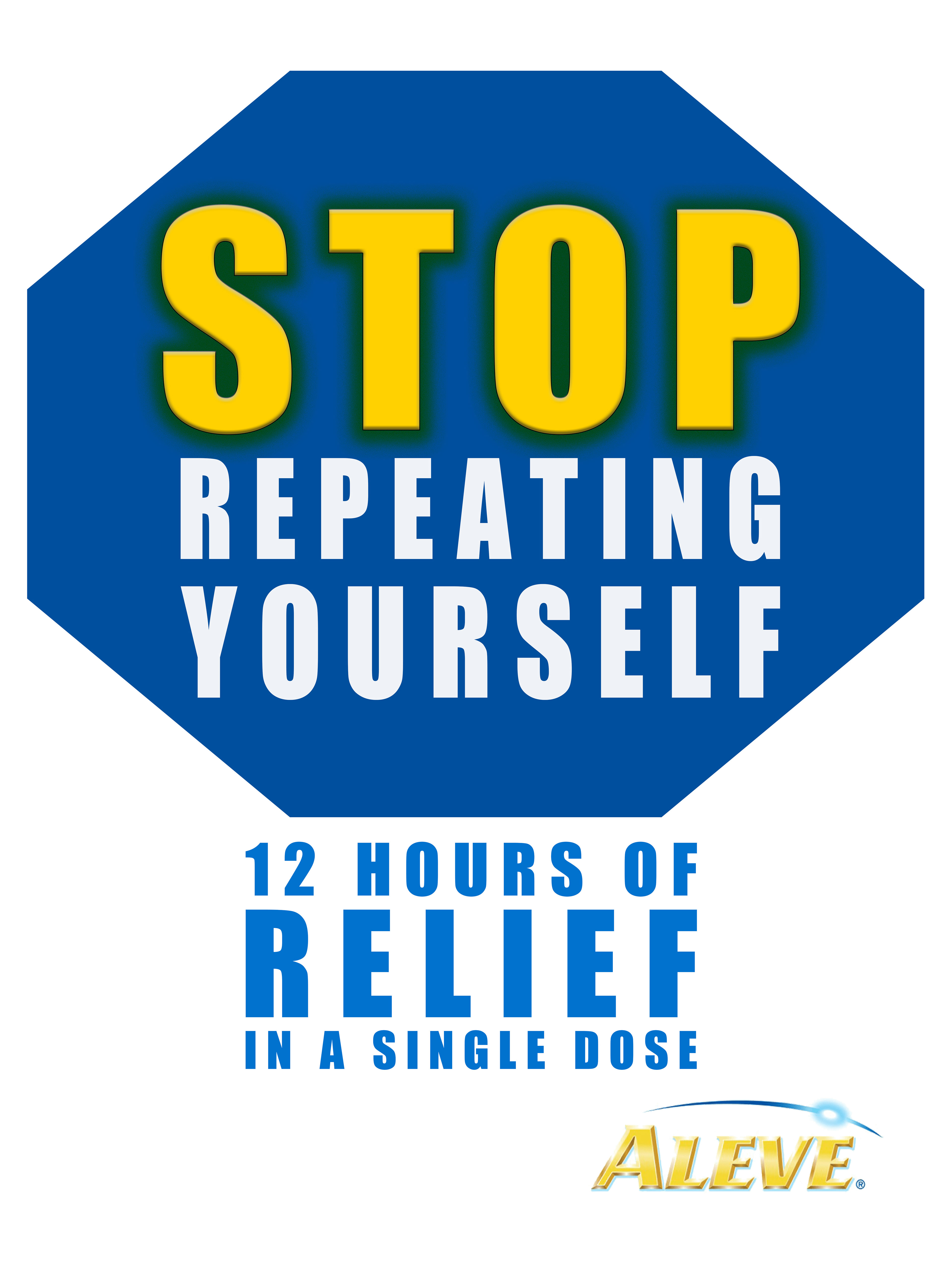
Aleve: Stop Repeating Yourself
Advertising & Branding · ADBR 150 · Professor Natasha Vasiljevic
Summary
A strategic print campaign for Aleve, designed to highlight its 12-hour relief advantage over competitors that require multiple doses.
The concept — “Stop Repeating Yourself” — plays on everyday repetition to emphasize Aleve’s lasting effectiveness with one simple dose.
The concept — “Stop Repeating Yourself” — plays on everyday repetition to emphasize Aleve’s lasting effectiveness with one simple dose.
Challenge
Aleve holds a strong reputation for long-lasting pain relief, but suffers from category fatigue — nearly identical messaging across the OTC pain-relief market.
The challenge was to communicate Aleve’s differentiator, 12-hour relief, in a way that felt bold, memorable, and unmistakably ownable.
The challenge was to communicate Aleve’s differentiator, 12-hour relief, in a way that felt bold, memorable, and unmistakably ownable.
Insight
In a world of constant repetition — alarms, emails, meetings, notifications — consumers don’t want another routine to manage.
They want simplicity that lasts.
Aleve’s single-dose endurance is the antidote to that daily loop.
They want simplicity that lasts.
Aleve’s single-dose endurance is the antidote to that daily loop.
Strategy
Create a campaign that mirrors Aleve’s straightforward benefit through equally straightforward design.
Use commanding typography and a stop-sign shape to communicate both interruption and control: take one dose, stop the cycle.
Use commanding typography and a stop-sign shape to communicate both interruption and control: take one dose, stop the cycle.
Execution
Headline: STOP REPEATING YOURSELF
Subline: 12 Hours of Relief in a Single Dose
Visual System: Octagonal “stop” shape with Aleve’s blue and yellow palette for immediate brand recall.
Typography: Heavy sans-serif for dominance, condensed type for urgency.
Layout: Centered hierarchy mimicking a traffic sign — direct, readable, impossible to ignore.
Media: Print and digital adaptations for pharmacy displays, transit ads, and OOH placements.
Reflection
This project reinforced the impact of restraint — how minimal design and copy, when aligned to a strong product truth, can cut through a saturated market.
It taught me that clarity is a design choice, and confidence often looks like simplicity.
It taught me that clarity is a design choice, and confidence often looks like simplicity.
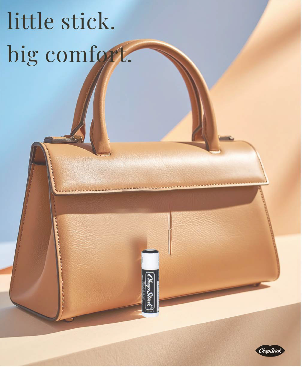
ChapStick: Little Stick. Big Comfort.
Advertising & Branding · ADBR 150 · Professor Natasha Vasiljevic
Summary
A luxury-inspired campaign for ChapStick repositioning an everyday essential through minimalist elegance.
The concept — “Little stick. Big comfort.” — reframes ChapStick as both functional and refined, highlighting how small, consistent rituals provide quiet luxury in daily life.
The concept — “Little stick. Big comfort.” — reframes ChapStick as both functional and refined, highlighting how small, consistent rituals provide quiet luxury in daily life.
Challenge
ChapStick is a legacy brand with broad familiarity but little emotional differentiation in the crowded lip-care market.
The creative task: refresh its perception without losing authenticity or accessibility.
The creative task: refresh its perception without losing authenticity or accessibility.
Insight
Comfort isn’t always grand — it’s found in the simple, reliable things we carry every day.
ChapStick’s strength lies in its familiarity; the creative opportunity was to reintroduce it as a timeless companion.
ChapStick’s strength lies in its familiarity; the creative opportunity was to reintroduce it as a timeless companion.
Strategy
Borrow visual language from luxury fashion campaigns to elevate the product’s perceived value.
By placing a single ChapStick next to a high-end handbag in soft light, the composition blends simplicity with sophistication — showing that comfort, too, can be stylish.
By placing a single ChapStick next to a high-end handbag in soft light, the composition blends simplicity with sophistication — showing that comfort, too, can be stylish.
Execution
Headline: little stick. big comfort.
Visual Direction: soft daylight, clean composition, and neutral tones to convey calm refinement.
Color Palette: sand, bone, and powder blue for a fresh, modern aesthetic.
Typography: lowercase serif to echo quiet confidence.
Product Placement: minimal yet intentional — ChapStick as both icon and object of design.
Media: digital, print, and social; optimized for scroll-stopper appeal on Instagram and lifestyle platforms.
Reflection
This project underscored the power of restraint.
Luxury isn’t about price — it’s about presentation, tone, and intention.
Through thoughtful minimalism, I learned how to reposition a mass-market product through design and narrative alone.
Luxury isn’t about price — it’s about presentation, tone, and intention.
Through thoughtful minimalism, I learned how to reposition a mass-market product through design and narrative alone.